Why Did Range Rover Introduce a New Emblem and What Does It Mean?
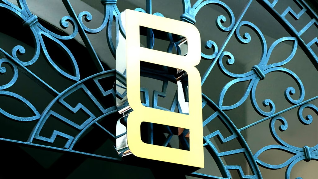
If you’ve ever glanced at a Range Rover and thought, “That’s a brand that knows how to make a statement,” you’re not alone. But even icons need a refresh now and then. JLR, the parent company behind Range Rover, has quietly unveiled a new emblem—a pair of overlapping Rs finished in gold. It’s a subtle nod to luxury, but don’t expect to see it plastered across every hood or steering wheel. The brand is clear: this emblem isn’t about replacing the classic Range Rover script or the familiar Land Rover oval. Instead, it’s designed for those smaller, more exclusive spaces where the full script just doesn’t fit—think event installations, labels, or even as a repeating pattern in design elements.
What’s the Story Behind the Double-R Logo?
The new logo first made its debut during an investor presentation and then popped up at Milan Design Week, perched atop an archway in shimmering gold. It’s a clever bit of design—stacked, mirrored Rs that look both modern and timeless. When rendered in gold, the emblem oozes elegance; in black, it loses a bit of that magic, but still carries a sense of refinement. This isn’t just a logo for the sake of change. It’s a calculated move, signaling Range Rover’s intent to evolve without discarding what makes it special.
How Will the New Emblem Be Used?
Here’s where things get interesting. Unlike some brands that overhaul their entire visual identity overnight, Range Rover is taking a more measured approach. The classic Range Rover script isn’t going anywhere, nor is the Land Rover oval badge. According to JLR, the new emblem is meant for “limited-use spaces”—places where the full script or oval simply wouldn’t work. Imagine it on a bespoke label, as a motif on interior trim, or woven into the fabric of a special edition model. There’s even a new Range Rover Pattern, made up of interlocking Rs, that could find its way onto grilles or dashboard inlays. It’s about adding layers of luxury, not rewriting the brand’s DNA.
How Does This Fit Into JLR’s Bigger Strategy?
This isn’t just a one-off design tweak. The new emblem is part of JLR’s broader House of Brands strategy, which splits Jaguar, Discovery, Defender, and Range Rover into distinct sub-brands. Jaguar recently rolled out its own fresh logo, and now Range Rover follows suit. The idea? To give each brand its own voice and visual identity, making them stand out in a crowded luxury market. Discovery and Defender are the last two waiting for their own updates, so expect more news on that front soon.
Could the New Emblem Signal What’s Next for Range Rover?
With the all-electric Range Rover on the horizon—rumored to pack a punch with 542 horsepower from a dual-motor setup—there’s speculation that this new model could be the first to wear the double-R badge in production. It’s a smart move: as the brand pivots toward electrification and new markets, a fresh emblem helps signal that evolution without alienating loyal fans. According to a 2023 McKinsey report, luxury automotive buyers are increasingly drawn to brands that balance heritage with innovation. Range Rover’s approach fits that bill perfectly.
What Does This Mean for Range Rover Owners and Fans?
For current owners, there’s no need to worry about your vehicle looking outdated overnight. The classic Range Rover and Land Rover badges are here to stay. But for those who appreciate the finer details, the new emblem and pattern offer a glimpse into the brand’s future—a future where tradition and modernity walk hand in hand. It’s a bit like adding a tailored suit lining: most people won’t see it, but those who do will appreciate the craftsmanship.
The big takeaway? Range Rover’s new emblem isn’t about perfection—it’s about smarter adjustments. Start with one change this week, and you’ll likely spot the difference by month’s end. Sometimes, it’s the quietest updates that speak the loudest.

