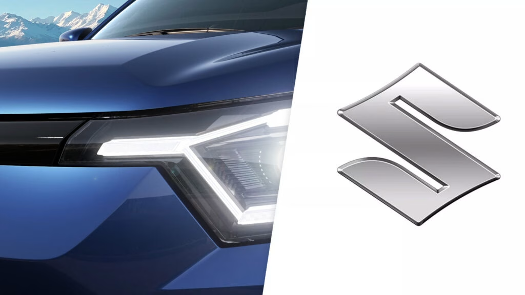
Why Did Suzuki Change Its Logo After 20 Years?
If you’ve ever glanced at a Suzuki badge and thought, “Haven’t I seen that before?”—you’re not wrong. Suzuki’s iconic “S” has barely budged since 1958. But for the first time in over two decades, the company has decided it’s time for a refresh. So, what’s behind this move?
The answer lies in the way we interact with brands today. Most of us meet logos not on car grilles, but on tiny smartphone screens, social media feeds, and digital dashboards. That glossy, three-dimensional chrome badge? It just doesn’t translate well to pixels. Suzuki’s new logo ditches the shine for a flatter, high-brightness silver look that’s easier on the eyes—and on the environment, too. The company points out that this matte aluminum-like finish is more eco-friendly than the old chrome.
But there’s more to it than just aesthetics. This redesign is part of a broader push to modernize Suzuki’s identity, aligning with their “By Your Side” slogan. It’s about showing customers that Suzuki is evolving alongside them, ready to meet the demands of a digital-first world.
How Does Suzuki’s New Logo Compare to Other Automakers’ Changes?
Suzuki isn’t alone in this flattening trend. Over the past few years, a parade of major automakers has swapped out their old-school badges for sleeker, two-dimensional versions. Think Volkswagen, Audi, Nissan, Mazda, BMW, Mini, Volvo, Kia, Opel, Renault, Peugeot, Aston Martin, Bentley, Lotus, Jaguar, Buick, and even Lamborghini. The list reads like a who’s who of the car world.
Why the sudden rush to go flat? Design experts say it’s all about clarity and consistency. Two-dimensional logos are easier to reproduce across digital and physical spaces. They scale down beautifully for app icons and social media avatars, and they don’t lose their punch on billboards or business cards. In short, they’re built for the way we live now.
Of course, not everyone’s a fan. Some argue that flattening logos strips away the sense of depth and craftsmanship that made them special in the first place. It’s a fair point—there’s something undeniably satisfying about a badge that catches the light just right. But in a world where attention spans are short and screens are small, simplicity often wins.
What’s Actually Different About Suzuki’s New Emblem?
Let’s get specific. The new Suzuki badge keeps the familiar “S” silhouette, a nod to the brand’s heritage. But look closer and you’ll spot the changes: the face is now smooth and flat, with subtle contours along the edges. Gone is the mirror-like chrome; in its place, a high-brightness silver that looks a lot like brushed aluminum.
This isn’t just about looks. Suzuki says the new finish is more sustainable, reflecting a broader industry shift toward greener materials. And because the proportions haven’t changed, the new badge can be swapped onto existing models without any awkward retrofitting. No waiting for a full redesign—just a quick badge update, and you’re good to go.
Where Will We See the New Logo First?
Suzuki’s updated emblem will make its public debut on concept cars at the Japan Mobility Show in October 2025. It’s a fitting stage for a brand looking to signal its future direction. After that, expect to see the new badge roll out across Suzuki’s global lineup, from compact city cars to rugged SUVs.
The transition should be seamless. Since the badge’s dimensions are unchanged, Suzuki can retrofit it to current models as they come off the production line. The recently launched Victoris SUV in India is likely to be among the first to wear the new look, signaling Suzuki’s commitment to both tradition and innovation in key markets.
What Does This Mean for Suzuki’s Brand and Its Customers?
At its core, this logo update is about more than just design. It’s a statement of intent. Suzuki President and CEO Toshihiro Suzuki put it best: the new emblem embodies the company’s commitment to “putting ourselves in the customer’s shoes to create valuable products.” The goal? To move forward together with customers and contribute to a sustainable future.
This isn’t just corporate speak. In today’s market, consumers expect brands to be agile, responsive, and environmentally conscious. A logo might seem like a small thing, but it’s often the first touchpoint between a company and its audience. By modernizing its badge, Suzuki is signaling that it’s paying attention—not just to design trends, but to the values and expectations of its customers.
Will This Change Affect Suzuki’s Reputation or Sales?
History suggests that logo changes can be a double-edged sword. When done right, they refresh a brand’s image and attract new attention. When done poorly, they risk alienating loyal fans. But Suzuki’s approach is measured. By retaining the core “S” shape and simply updating the finish, they’re striking a balance between heritage and progress.
Data from branding consultancy Interbrand shows that companies who successfully modernize their visual identity often see a boost in brand value and consumer engagement. It’s not a magic bullet, but it’s a smart move in a crowded, fast-changing market.
The big takeaway? Suzuki’s new logo isn’t about chasing trends or erasing the past. It’s about making smarter, more sustainable adjustments for a digital world. Start looking for that new badge on the road, and you’ll see how even a subtle shift can make a brand feel fresh again.

