Why Did Cadillac Have Birds in Its Logo in the First Place?
If you’ve ever squinted at an old Cadillac crest, you might have spotted a few tiny birds tucked into the design. Not everyone noticed them, but for those who did, the question lingers: why were there birds—specifically, ducks—in the Cadillac logo? The answer takes us back to the roots of the brand and the man it’s named after.
Cadillac’s logo draws inspiration from the family coat of arms of Antoine de la Mothe Cadillac, the French explorer who founded Detroit in 1701. Heraldry was a big deal back then, and coats of arms were packed with symbols meant to convey status, lineage, and a bit of personal flair. The birds in the crest aren’t just random wildlife—they’re actually merlettes, a stylized version of a duck or blackbird commonly used in French heraldry. These merlettes symbolized knightly virtues like bravery, resourcefulness, and noble lineage. For Cadillac, a brand that’s always positioned itself as a symbol of American luxury and aspiration, those little birds were a nod to its aristocratic European roots.
What Happened to the Ducks in the Cadillac Logo?
Fast forward to the late 20th century, and Cadillac’s logo was starting to look a bit, well, busy. The crest had become a patchwork of colors, shapes, and those famous ducks. As design trends shifted toward minimalism and sleekness, Cadillac’s ornate emblem began to feel out of step with the times.
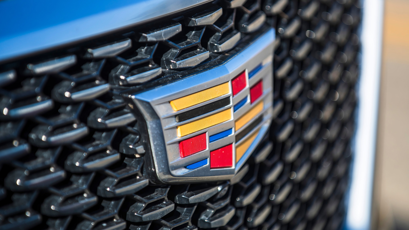
In 2000, Cadillac made a bold move. The company streamlined its logo, stripping away many of the intricate details—including the merlettes. The new design focused on bold lines and a more modern, geometric look. According to interviews with Cadillac designers, the goal was to create a logo that reflected the brand’s push toward innovation and contemporary luxury, rather than nostalgia for the past. The ducks, charming as they were, simply didn’t fit the new image.
How Do People Feel About the Change?
Reactions to the logo update were mixed. Some longtime Cadillac fans missed the old crest, ducks and all, seeing it as a link to the brand’s storied history. Others welcomed the change, arguing that the simplified logo better matched Cadillac’s evolving lineup and ambitions.
Branding experts point out that Cadillac isn’t alone here. Many luxury automakers—think BMW, Mercedes-Benz, and Audi—have also pared down their logos in recent years, aiming for clean, instantly recognizable designs that look good on everything from a car grille to a smartphone screen. The shift isn’t just about aesthetics; it’s about making the brand feel fresh and relevant in a crowded market.
Are There Any Hidden Meanings Left in the Current Logo?
Even without the ducks, Cadillac’s crest still packs a symbolic punch. The colors and shapes nod to the original coat of arms, while the shield itself remains a sign of heritage and prestige. The current logo’s angular lines and symmetry are meant to evoke precision and forward momentum—qualities Cadillac wants to be known for as it competes with both traditional luxury rivals and upstart electric brands.
If you look closely, you’ll still see echoes of the past. The laurel wreath, once a prominent part of the logo, was also removed in 2014 to further streamline the design. Yet the essence of Cadillac’s history remains, just in a subtler, more modern form.
Why Do Car Logos Change So Much Anyway?
Car logos aren’t just decoration—they’re a brand’s handshake with the world. As consumer tastes evolve and technology changes how we interact with brands, logos have to keep up. What looked prestigious in the 1950s can seem fussy or outdated today. Plus, with cars now appearing in digital spaces as much as on the road, logos need to be versatile and instantly recognizable at any size.
Cadillac’s journey from ornate crest to sleek badge mirrors its own evolution as a company. The brand has been working hard to shake off its old-school image and appeal to a new generation of drivers, especially as it moves into electric vehicles and cutting-edge tech. The logo is just one piece of that puzzle.
What’s the Big Takeaway for Cadillac Fans?
The story of the missing ducks in the Cadillac logo is really about how brands balance tradition and innovation. Cadillac didn’t erase its history—it just found a new way to express it. If you’re a fan of the old crest, there’s nothing stopping you from appreciating its artistry and the story it tells. But don’t be surprised if the next Cadillac you see sports a badge that’s all sharp edges and modern flair.
The big takeaway? Cadillac’s logo isn’t about perfection—it’s about smarter adjustments. Start with one change this week, and you’ll likely spot the difference by month’s end. Sometimes, letting go of a few details is what lets a classic brand keep moving forward.


